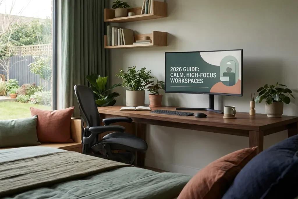
For years, interior design advice for home offices preached a single doctrine: paint everything stark, reflective white to maximize perceived light. However, years of remote work and continuous screen immersion have revealed the hidden toll of clinical minimalism. High-glare white walls foster visual distraction, bounce harsh monitor backlighting directly into the eyes, and fail to offer the mind a place to rest during moments of cognitive strain.
The modern interior design palette for 2026 has shifted toward emotional grounding and restorative environments. Leading residential architects and ergonomic designers are turning to Earthy Tones & Restorative Darks—a rich blend of organic terracottas, muted moss greens, warm espresso, and deep slate charcoals.
By wrapping your working environment in deep, pigment-rich colors, you reduce visual noise, soften screen contrast, and signal your parasympathetic nervous system to remain calm during demanding workdays. This guide breaks down the science, material pairings, lighting strategies, and practical steps needed to transform your workspace into a restorative sanctuary.
The Ultimate 2026 Guide to Layered & Ambient Lighting: Transform Your Space
Table of Contents
The Psychological Impact of Color: Moving Beyond Sterile Minimalism
The human nervous system evolved surrounded by the muted, textured shades of nature. When we lock ourselves into brightly lit, monochrome white boxes for ten hours a day, our brains register an unnatural environment that amplifies stress and sensory fatigue.
+-------------------------------------------------------------------------+
|                  THE VISUAL FATIGUE VS. FOCUS MATRIX                    |
|                                                                         |
|   CLINICAL STARK WHITE ILLUSION:                                        |
|   - High light reflectance value (LRV 85-95%)                           |
|   - Severe contrast between dark screens and bright wall backdrops      |
|   - Elevates eye strain, micro-distractions, and cortisol spike         |
|                                                                         |
|   EARTHY TONES & RESTORATIVE DARKS REALITY:                             |
|   - Low-to-moderate reflectance value (LRV 10-40%)                     |
|   - Absorbs harsh light scatter and softens screen outline boundaries    |
|   - Promotes slow-wave focus, visual rest, and emotional stability      |
+-------------------------------------------------------------------------+
The Biology of Visual Anchoring
High Light Reflectance Value (LRV) paint surfaces scatter ambient light unpredictably. When your eyes move away from a bright computer display to rest on a glaring white wall, your pupils rapidly constrict and dilate to accommodate the shift.
Integrating Earthy Tones & Restorative Darks into your home office creates an anchor for your visual field. Deep colors lower light scatter, allowing your eyes to rest comfortably when taking breaks from screen work.
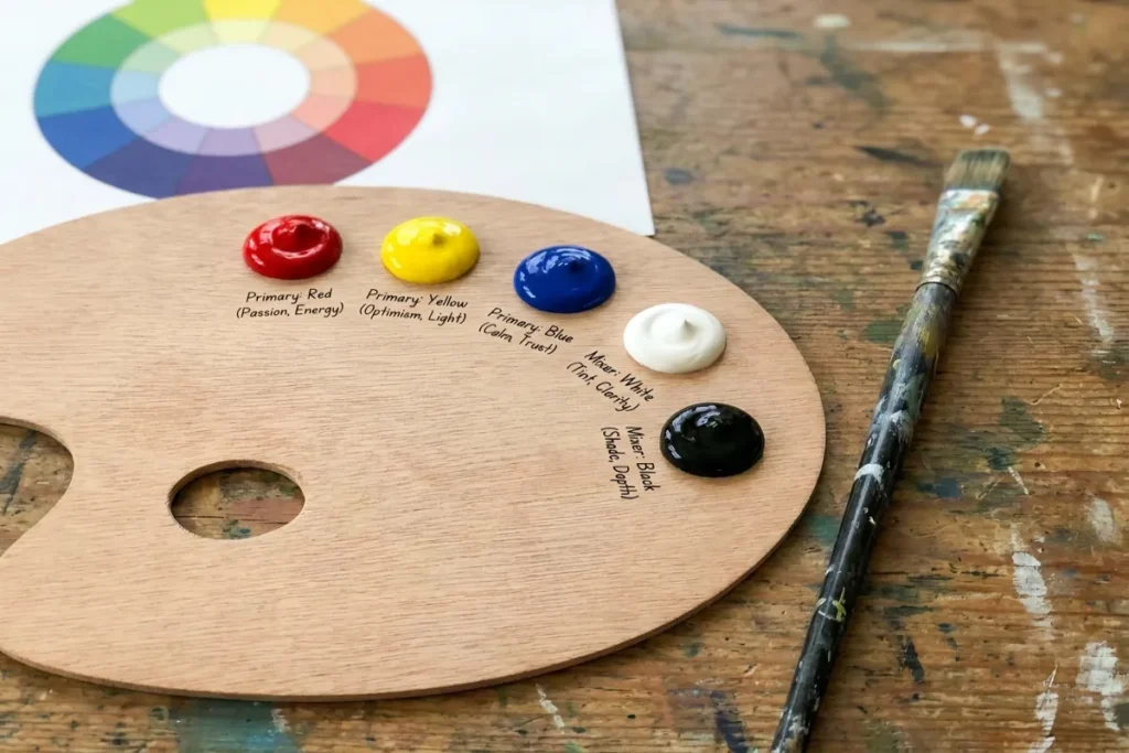
Unpacking the Palette: Core Colors and Their Functions
Designing with darker and warmer shades requires an understanding of tone harmony. Rather than turning a room into a gloomy cave, the goal is to layer natural pigments that feel alive.
+-------------------------------------------------------------------------+
|                  THE RESTORATIVE PALETTE SPECTRUM                       |
|                                                                         |
|   [EARTH TONE BASE]           [RESTORATIVE DARK ANCHOR]                 |
|   - Warm Terracotta & Clay    - Deep Charcoal & Slate                   |
|   - Muted Ochre & Raw Umber   - Midnight Forest Green                   |
|   - Warm Sand & Soft Linen    - Espresso & Smoked Walnut                |
+-------------------------------------------------------------------------+
1. Warm Terracottas, Ochres, and Clays
Earthy mid-tones add warmth without the overstimulating energy of primary reds or yellows. Terracotta anchors the space in natural warmth, making virtual meeting backgrounds feel welcoming and grounded.
2. Deep Forest Greens and Sage Mutes
Green remains the premier color for cognitive restoration. Deep pine, moss, and muted sage hues mimic dense forest canopy light, reducing anxiety while maintaining mental alertness.
3. Charcoal, Espresso, and Slate Darks
Restorative darks are not cold black; they are complex, warm-toned darks with brown, green, or violet undertones. Colors like deep espresso or charcoal slate envelop the room, creating an intimate, cozy atmosphere that enhances focus.
Palette & Reflectivity Matrix
Selecting the right paint finish and reflectance level is critical when introducing dark pigments into a workspace:
| Color Family | Example Palette Shades | Recommended Paint Finish | Ideal Room Position / Function |
| Warm Earth Tones | Terracotta, Clay, Muted Ochre | Matte or Eggshell | Main focal wall behind desk, accent niches |
| Biophilic Greens | Deep Pine, Moss, Sage | Velvet / Low-Sheen Flat | Line of sight behind monitors to ease eye strain |
| Restorative Darks | Charcoal Slate, Smoked Espresso | Ultra-Matte / Flat | Full room color-drenching or ceiling wrap |
| Soft Transition Tones | Sand, Raw Linen, Muted Taupe | Satin or Eggshell | Trim, door frames, and adjacent shelving units |
Interactive Room Palette & Lighting Planner
Use the interactive design tool below to preview how different combinations of earth tones, restorative darks, and color temperatures interact in a workspace layout.
Lighting Strategies for Deep & Dark Workspaces
A common misconception is that dark walls make a room feel small or depressing. In reality, dark walls recede visually because their corners dissolve into shadow, creating the perception of boundless space—provided your lighting strategy is correct.
Layered Lighting vs. Single Overhead Fixtures
Never rely on a single central ceiling light when using deep wall tones. Overhead lights cast harsh downward shadows and turn dark rooms dreary. Instead, deploy a three-layer lighting scheme:
- Task Lighting: Focused light directly on your workspace surface (3000K to 4000K) to keep your active work deck illuminated.
- Ambient Glow: Dimmable warm lamps (2700K) placed at eye level in room corners to create soft illumination.
- Screen Backlighting (Bias Lighting): LED light strips mounted behind your monitor casting light onto the dark wall behind it. This eliminates glare and prevents screen float fatigue.
Material Pairing: Texture Prevents Monotony
When working with Earthy Tones & Restorative Darks, texture is what prevents a room from feeling flat or sterile. Rich pigments require tactile surfaces to catch the light softly.
+-------------------------------------------------------------------------+
|                    TEXTURE & MATERIAL LAYER GUIDE                       |
|                                                                         |
|   NATURAL WOODS         TEXTILES & FABRICS       TACTILE ACCENTS        |
|   - Oiled American Walnut - Wool Felt Desk Mats     - Brushed Brass       |
|   - Reclaimed Teak       - Linen Window Drapes    - Terracotta Pottery  |
|   - Matte Blackened Oak  - Bouclé Accent Chairs   - Woven Jute Rugs     |
+-------------------------------------------------------------------------+
- Warm Hardwoods: Pair charcoal or deep green walls with rich walnut, cherry, or oiled oak desk surfaces. The wood grain brings organic life into dark spaces.
- Matte Metals: Avoid shiny chrome. Instead, use hardware finished in brushed brass, antique copper, or matte black to complement earth-toned walls.
- Soft Woven Textiles: Add heavy linen curtains, wool felt desk pads, and woven jute area rugs to absorb room sound and introduce physical warmth.

5 Practical Steps to Redesign Your Home Office Today
Transitioning from a stark white room to a grounded, restorative environment can be accomplished systematically:
- Identify Your Screen Wall: Choose the wall directly behind your primary monitor. Paint this wall first using a deep, matte restorative dark shade (like midnight green or slate charcoal) to eliminate screen contrast strain.
- Eliminate High-Gloss Finishes: Ensure all paint selected for dark walls is flat, ultra-matte, or low-sheen eggshell. High-gloss finishes reflect light sources, creating annoying glare spots on dark surfaces.
- Incorporate Living Biophilic Elements: Position large leafy plants—such as Fiddle Leaf Figs, Monsteras, or Snake Plants—against dark walls. The contrast between bright green foliage and deep wall pigments makes plants pop visually.
- Install Dimmable Warm Lighting: Replace harsh 5000K daylight bulbs with dimmable, high-CRI 2700K–3000K warm LED bulbs to highlight wall textures softly.
- Swap Synthetic Accessories for Clay & Wood: Replace plastic desk organizers with terracotta pots, wooden trays, and ceramic stoneware mugs to complete the organic aesthetic.
Reclaim Your Focus with The Tek World
Adopting Earthy Tones & Restorative Darks allows you to transform your home office from a sterile task station into a high-focus sanctuary. By balancing deep natural pigments with warm lighting and tactile materials, you protect your visual health and cultivate a sense of calm that lasts throughout the workweek.
Looking for in-depth reviews on workspace lighting, ergonomic setup guides, desk accessories, and interior studio setups updated for 2026? Visit thetekworld.com for expert buying advice and practical guides designed to elevate your everyday work environment!
Frequently Asked Questions (FAQ)
1. Will painting my small home office in dark tones make it feel claustrophobic?
No. When applied in matte finishes, dark colors absorb light and blur the edges where walls meet corners. This creates an optical illusion of depth, making small rooms feel expansive and cozy rather than tight or boxed in.
2. What color temperature light bulbs work best with dark and earthy wall colors?
Warm to neutral light temperatures between 2700K and 3000K work best. Warm lighting brings out the rich undertones in terracotta, brown, and deep green without washing out the pigments or creating harsh highlights.
3. How do I prevent my camera background from looking too dark on video calls?
Position a warm key light or ring light slightly off-axis in front of you to keep your face clearly lit. The contrast between your lit face and the rich dark background behind you will create a professional, studio-quality depth of field on camera.
4. What is the easiest earth-tone accent to start with if I’m not ready to paint whole walls?
Start with desk textiles and small accessories. A large wool felt desk mat in terracotta or forest green, paired with a walnut monitor stand and terracotta planters, introduces the grounding benefits of earth tones without committing to paint immediately.

Comments